Part of my January webinar dealing with Adobe Captivate involves further discussion of fluid boxes. Participants in previous webinars asked me to provide more details.
This webinar is part of an ongoing series I am presenting on Adobe Captivate. For those who are interested in earlier sessions, you will find links below.
- Overview of using Captivate to record a video (March, 2017)
- Creating responsive eLearning assets with Captivate (April, 2017)
- Personalizing Captivate (May, 2017)
- Captivate software simulations (June, 2017)
- Captivate branching (September, 2017)
- Creating a quiz in Captivate (November, 2017)
Fluid boxes are found in Adobe Captivate 2017. When you create a new responsive project (and apply a responsive theme), they are present by default. We now live in a world where many individuals access eLearning content on mobile devices. We need to recognize that our eLearning materials will likely be accessed via a mobile device (specifically a web browser on said device). Therefore, our materials need to be responsive. This is what fluid boxes are all about.
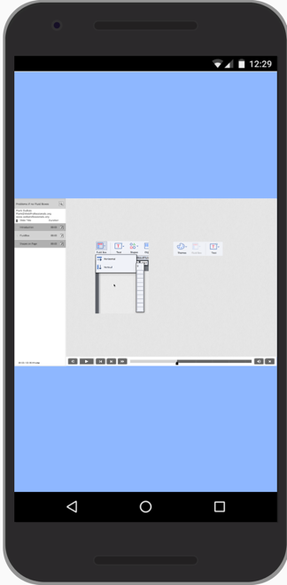
Consider this simple example (viewed with the Chrome developer tools mobile device settings). You will note the page sizes to fit the device (and the text and images are nearly impossible to read).
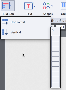
Fluid boxes allow you to decide how to arrange your materials so they display more appropriately on mobile devices. When you first create a responsive project in Captivate 2017, you will see the option in the menu. Note that they can be either vertical or horizontal (and can be nested). Think in terms of rows and columns. If the Fluid Box icon is greyed out, the most likely reason is that you have not created a responsive project (or are using older materials developed in a prior version of Captivate).
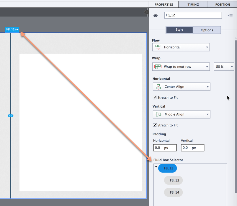
Once you create a new slide, you can add fluid boxes in your responsive project (or modify the ones that are already present). Think of these as containers which reflow parts of the page if the content is viewed on devices with smaller screen real estate. Each Fluid Box will have a unique name and you manipulate the properties as needed (including the name of each Fluid Box). Hover over the edge of a Fluid Box and you will be able to see the properties (when you click on that edge). Note the bounding box, name, and properties in the screen capture below.
Think in terms of containers within containers when working with Fluid Boxes. You decide how you want your content to display on various devices and then build the appropriate structure. If your structures are complex, I recommend sketching out the result before you build it in Captivate. The containing Fluid Box can be optional or static.
Optional means that the contents of the Fluid Box will not display when there is a limited amount of screen real estate (you control that as a percentage – 100% = desktop resolution). You must also set the content Wrap to Squeeze in order for the optional content not to display. Personally, I rarely use this option. After all, if you believe something is optional, why include it in the first place.
Static means that we want the relative alignment of objects to remain the same regardless of the screen resolution. That is indicated with the number 1 in the screen capture below. Perhaps we have smart objects pointing to parts of an image or a similar need for the relative positions to remain the same.
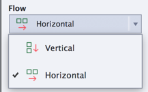
The above options are check boxes on the properties of the Fluid Box (screen capture below). We also see there are options to control the Flow, Wrap, Horizontal alignment, Vertical alignment, Padding and the Fluid Box Selector. We also see more options (indicated by the number 2 in the screen capture below).
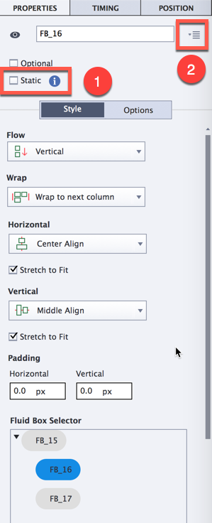
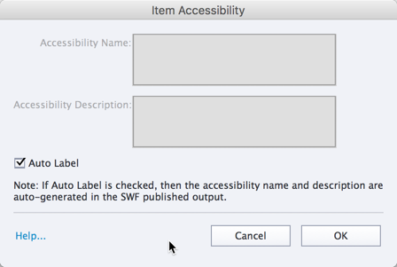
The options allow us to make our eLearning materials accessible. If one clicks on the icon represented by the number 2 above, one sees the following screen. Frankly, accessibility could be a complete discussion of another webinar (stay tuned – that may happen in the future). Note that Auto Label is activated by default.
For those who wish to learn more about making your Captivate project accessible, I recommend the initial Adobe resource dealing with Captivate accessibility best practices.
Let’s examine the remaining properties in a bit more detail.
Flow is the first property. This was set when we created our Fluid Boxes. IT can be either vertical or horizontal. Think in terms of rows and columns and how items are laid out. I typically think in terms of left to right and top to bottom. If your language differs, you will need to change the flow accordingly.
Wrap controls what happens when that Wrap Point is reached on a device. One can think of 100% as the desktop view. A percentage of this amount will cause wrap to happen. By default, this is set to 80%. If our desktop resolution is 1024 pixels wide, 70% would be roughly 715 pixels (roughly). If a device could not display more than 700 pixels, we might want to re-position the content to display in a different manner (to maximize the available screen real estate). Often, we would want to move items (or squeeze them).
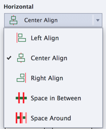
These are the options available for Horizontal alignment. I typically use either left or center alignment. There is also a “stretch to fit” check box. If you want your contents to fill the Fluid Box, make certain this is checked.
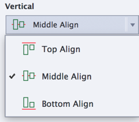
These are the options available for Vertical alignment.
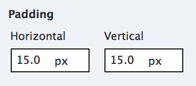
Padding represents the pixels (space) on each side of the Fluid Box. I typically don’t use this unless there is a specific reason to include. Keep in mind that padding will reduce the amount of screen real estate available. And, you are displaying this on devices with limited screen real estate to begin with.
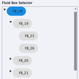
Lastly, the Fluid Box Selector allows you to see how these items are nested and to choose any to examine specific properties). You will note that you can twirl down to see the nested contents.
So, what does all this look like when we develop our eLearning resources? Here are a couple of example files. I also included the .CPTX files (as zip archives). Feel free to download and examine them. Note that you will need Adobe Captivate 2017 to open them.
- Example of responsive project with fluid boxes. Zip archive of .CPTX file.
- Example of non-responsive project without fluid boxes. Zip archive of .CPTX file.
 Loading ...