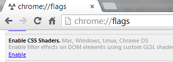
The world of CSS is changing rapidly and CSS-filters are definitely a great indication of what is coming to a browser near you soon. In order to actually work with these, you will need Chrome Canary (the experimental version of Chrome). Note that you can run this version alongside your standard Chrome browser. Once you have installed Chrome Canary, you will need to activate the experimental feature which allows CSS-Shaders/ filters to work. To accomplish this, enter the phrase about://flags into the address/ URL files in Canary. Scroll down and enable (see screen capture below). You will need to relaunch the browser for thse changes to take effect.
Once you have done this, you are ready to work with tools like the CSS Filter lab at Adobe.Alan Greenblatt has done a lot of work with CSS-Shaders and has some great presentations. If you follow the last link and have Chrome Canary installed and enabled CSS shaders, you will be able to watch a page curl. Go back a few slides adn you can make an image of a tree wave as you move your cursor around. There are some impressive things one can accomplish.
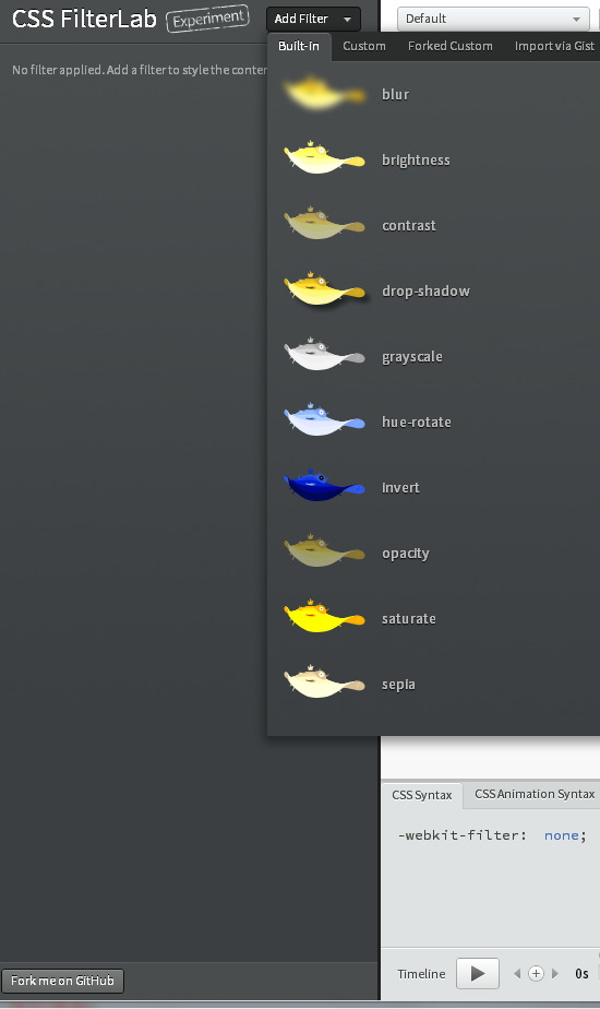
As a starting point, I recommend using the Adobe CSS FilterLab. You can also download the code (and samples) from github, but I prefer the online version. I include a screen capture below. Note that you can add a number of filters. You can also see the generated CSS code at the bottom and watch the effects applied to the default image. You can copy the CSS code and try it out on your own images also.
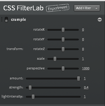
Once you choose the desired effect, you will see the results. In this case, I selected crumple effect effect. Note the screen captures below. You can visually control the effects.
The resulting CSS code is also available for inclusion in your example pages.
-webkit-filter:
custom(url(shaders/vertex/crumple.vs) mix(url(shaders/fragment/crumple.fs)
multiply source-atop), 50 50 border-box, transform perspective(1000)
scale(1) rotateX(0deg) rotateY(0deg) rotateZ(0deg),
amount 1, strength 0.4, lightIntensity 1);
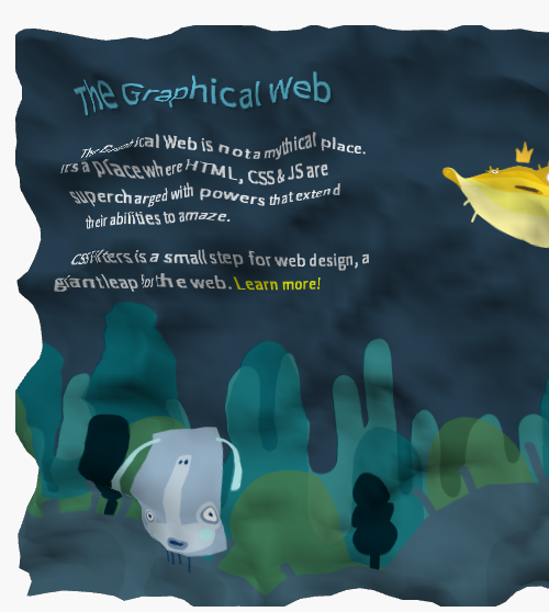
The resulting crumpled image is shown below.
I encourage you to visit the CSS FilterLab and experiment to learn more about these CSS effects. There is the ability to include animations and a lot of most interesting effects. You should have a better understanding of the emerging capabilities of CSS. I look forward to your comments.


Hello Mark thanks for useful info. I’ve created interactive Globe using CSS shaders and Google maps check the demo: http://updates.html5rocks.com/2012/09/Interactive-Globe-with-CSS-shaders-Google-Maps
Looks like another great example. Thanks for sharing.
Best,
Mark