I recently read the book “Get Ready for CSS Grid Layout” by Rachel Andrew. The more I understand about CSS grid layout, the more I like it and hope it is soon implemented in browsers. Presently it works well in Canary and mostly in Firefox nightly builds. I will include screen captures in my discussion in the event you do not want to download Canary to see them first hand. To me, the quote by Eric Meyer in the forward to the above book sums up this improvement.
“Grid Layout is to Flexbox as PNG is to BMP, and then some.”
Let’s examine some bits of code to better understand the capabilities.
First, we need a set of HTML objects to style with CSS. Enter the mighty <div>. This is the code which I will style in most of the examples.
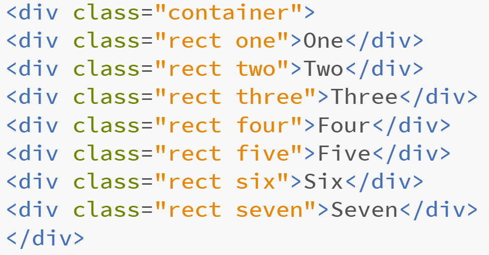
Pretty exciting stuff, huh? You will note a wrapper with a class of “container” and seven divisions each with a class of “rect” and a unique identifier for each of them – “one” through “seven.” I know, I sometimes just get too clever for words.
Before we get started, a little terminology.
Grid lines – these make up the grid. They can be horizontal or vertical. They can be numbered or named. I use both approaches in some examples. Think in terms of rows and columns in a spreadsheet.
Grid tracks – these are the spaces between two grid lines. As with lines, they are horizontal or vertical. Think of these as the gutters (whitespace) between lines.
Grid cell – the smallest unit of a grid. Think in terms of s cell in a spreadsheet or a table cell in a table displaying data. It is the space between four grid lines (start and stop for both column and row).
Grid area – the part of a grid bounded by four grid lines. Yes, a grid cell is the smallest grid area, but a grid area can contain multiple cells.
Although I have not used this in my examples, there is a new unit you can employ with your CSS – fr. This relates to proportions. It is typically used with Flexbox and Grid. The W3 site has a nice more detailed explanation.
Ok, let’s see what we can do with CSS grid. First, we need to specify the display as a grid. This is done on line 11 below.
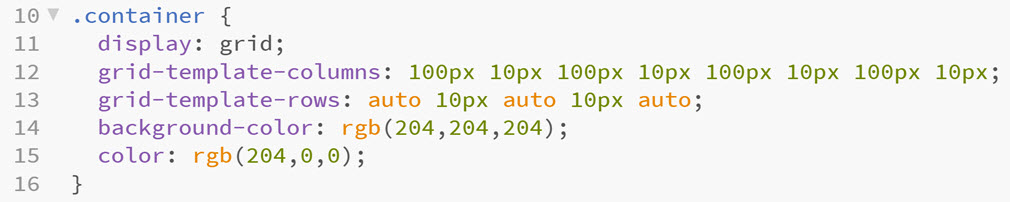
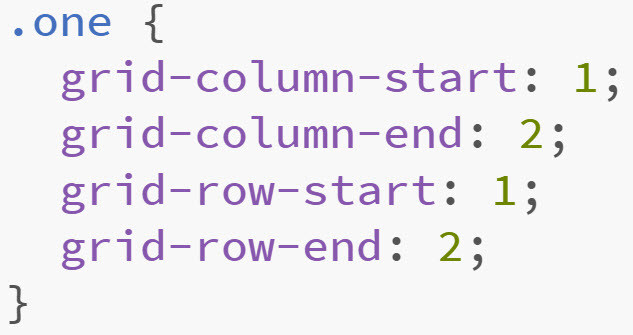
We also define the number of columns and rows in the grid. In line 12, I explicitly specify 8 columns. In line 13, I specify 5 rows. Note that I can set these values to specific number of pixels or other sizes. Next, we need to specify where to place each of the divisions in our HTML. For example, I specify the starting and ending rows and columns for one of the classes. [Yes, that was a pun.]
We can use a shorthand and separate the starting and ending values with a slash. Remember TRBL when specifying margins and so forth. We can do something similar. I have avoided this as I don’t want to confuse anyone.
And, with that, we save our work and open it in a browser and see the following…
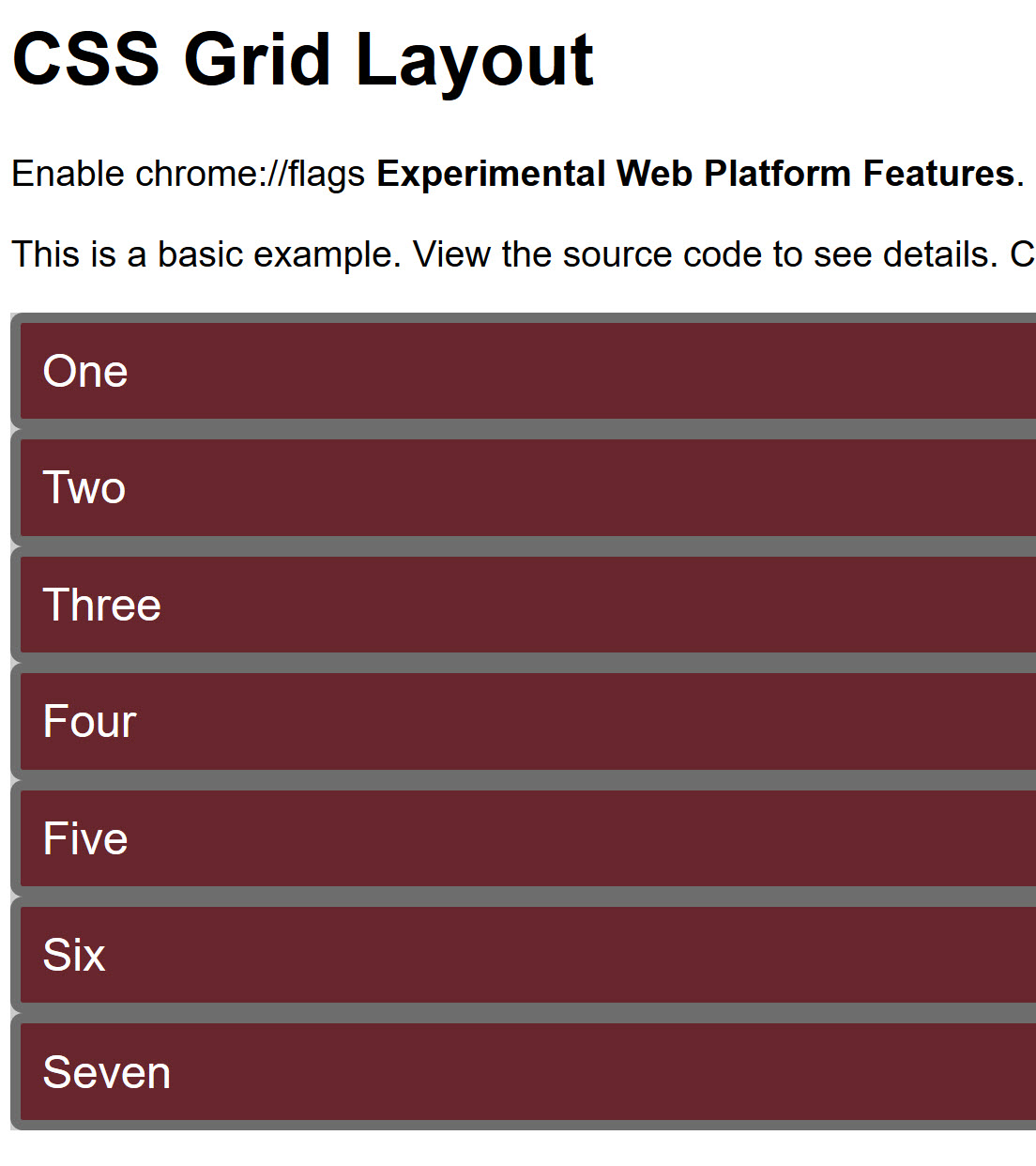
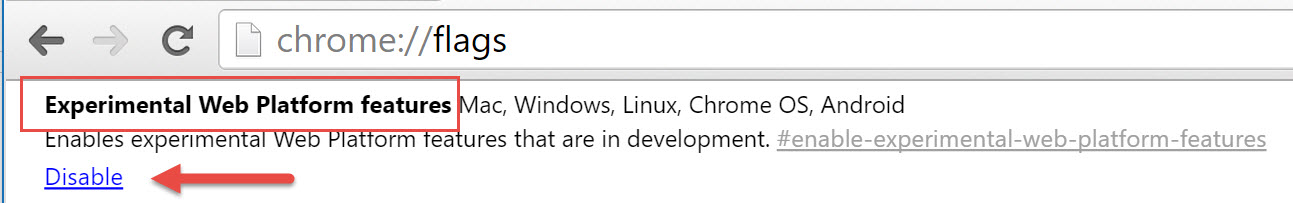
Oh, yeah. We need to use browser which supports this experimental feature. So we install Canary and enter chrome://flags to enable the Experimental Web Platform features. Then we visit the page in Canary.
Now we see…
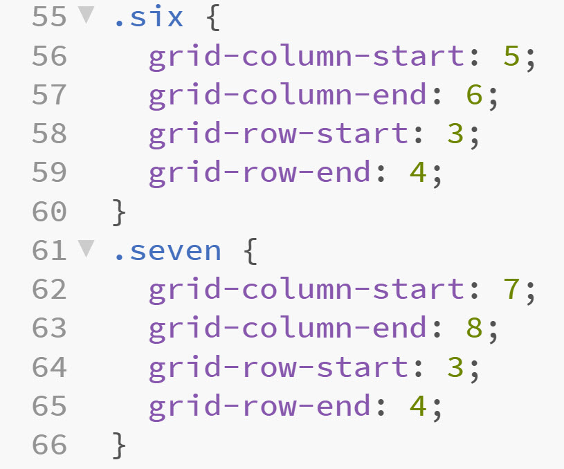
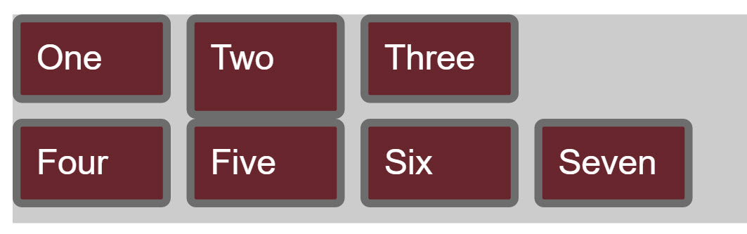 Cool, it does work. Note that the seven box comes after the six box. The CSS code is below. Grid-row-start and end are specified as 3 /4 below.
What happens if we change the numbers to 1 and 2 on lines 64 and 65 respectively?
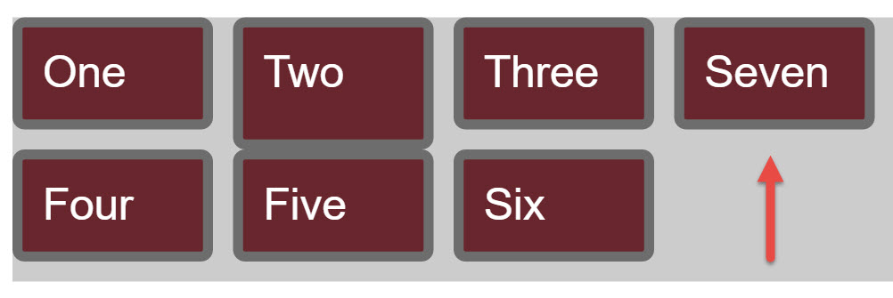 Note that the box has now moved to the first row and is positioned after three. One little change. No clear, no float. I find this pretty impressive.
But numbers seem a bit clunky. And – that is where names can be employed. We can assign names to columns and rows. The ones I chose are arbitrary. I would think one would want to must more semantic markup in a production environment. In the example below, I have assigned names to the grid lines.
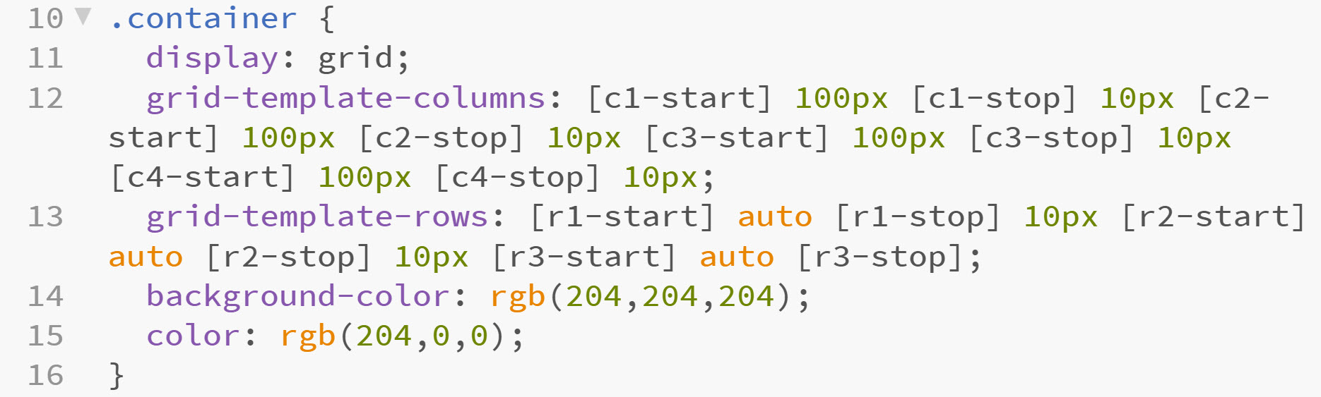
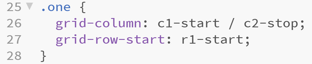
Now that I have assigned names, I can reference those as I position my divisions on the page. You will see I am starting to use the shorthand as I become more familiar with the CSS grid.
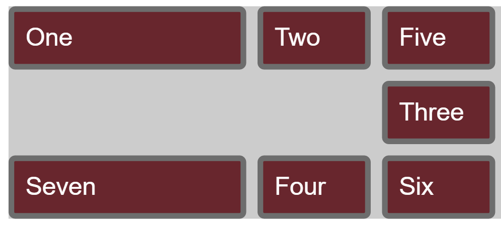
With a little creativity, I now have the items displaying as follows. Note the background displays if there is nothing inn a particular cell.
Ok, cool. Now what? I can also define template areas. At the moment, it seems a bit cumbersome as you must specify the placement of items. In this case, header will span all the cells in the first row and so forth.
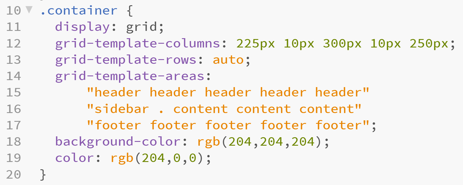
Now, I can specify these names in my content. Yes, I moved away from my classes of one and so forth.
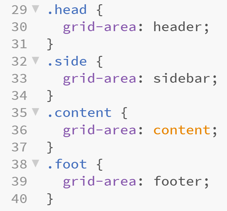
The results are shown in the screen capture below.
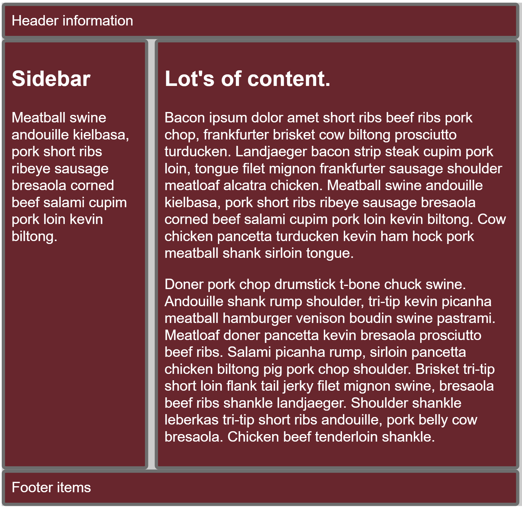
To me, this is infinitely easier than trying to do all the floats, clears and other positioning tricks of the past.
You can see these examples in action. Just make certain you use the appropriate browser. No, they won’t display properly unless you activate the experimental features. Again, I recommend Canary.
If you would like to learn more about this enhancement, I recommend the more detailed explanation at the W3C site. Obviously, I also recommend Rachel Andrew’s book. It is succinct and well written.
 Loading ...