I recently became aware of the CSS Shack project and thought it might be useful for readers of this blog. As I understand it, CSS Shack is available both as a desktop application (for Windows and Linux) and as a Chrome browser extension. I decided to focus on the latter (since it is a free extension and many readers of this blog are web design students with limited budgets). Why do I mention tools like this? It is mid-2014 and we have a number of browser environments where our pages will be viewed. Of course, all browsers display CSS-3 code in exactly the same manner (sadly, NO). Therefore, we need to employ browser specific instructions for various environments. These subtle differences must be accounted for (consider -webkit, -ms, -moz, -o, and the default that someday all browsers will recognize). If we want to include a simple gradient as a background, we need to employ a number of browser hacks. And it is quite easy to make a typo (or forget one). I may also want to meet with a client to rapidly prototype a page and this is another tool I can use for in browser design/ development.
Assuming you have installed the Chrome browser extension, you will see the following icon when displaying your installed apps.
After opening the app, we can create multiple layers and make a number of quick changes to your CSS. You can also examine specific bits of generated code and you can export all your work for later use/ modifications.
Let’s first examine the layers options (on the left). I included a screen capture below. You will note you can create new layers (just click the plus (+) icon. You can also name the layers (I think this is always a good idea). Just click on the layer name and change it.
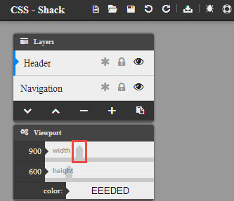
Note you can also change the size of the viewport. If you move the slider (highlighted above), you may not get the desired width or height. Just get close and then use the arrow keys on your keyboard to get the exact desired dimensions. If you are designing for mobile as well as desktop (always a good idea these days), you may want to have several files. Unlike tools like Adobe Edge Reflow, I can not find a quick way to display multiple viewports at one time. As you see in the screen capture above, you can also lock layers (so you don’t make additional unwanted changes). Yes, there are also undo and redo capabilities (if you need them).
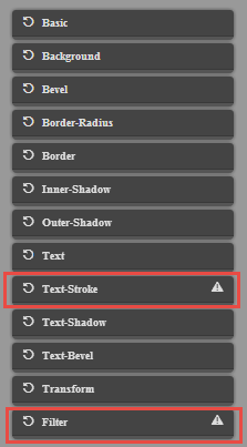
There are a number of different effects you can employ. Those which are partially supported in modern browsers are highlighted in the screen capture below.
Since you may be working with multiple layers, make certain you have the appropriate layer selected. Once you have done that, let’s focus on the panels on the right of this tool. I have included a screen capture with parts of the panels open to show the effects/ features. I am working with divisions so I can control the sizes of those. In my case, I am working with a layer I called navigation and have set the opacity to 50% (0.5) and a height of 50 pixels and a width of 900 pixels.
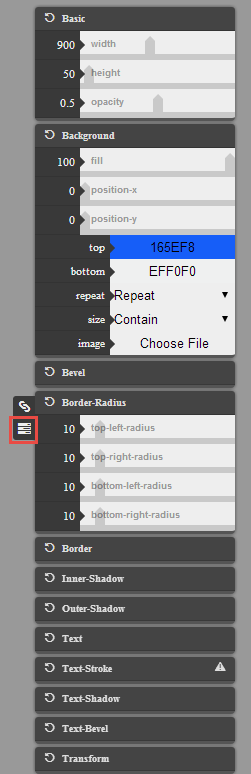
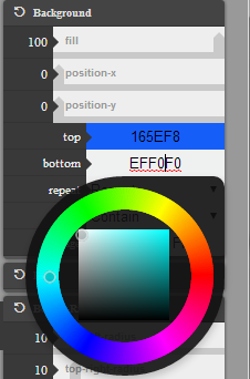
For some features (such as border radius), I can click on the stack icon (highlighted above) to work with individual properties [alternately, i can apply the same changes to all of these]. You will also note that I selected color gradients. There is a built in color selector (as shown in the screen capture below).
I can also select a layer and examine the code (icon for code is on bottom left of the tool). You can copy the selected code (icon on the lower right). Keep in mind this is just for the selected object.
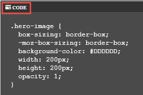
Although this is far from perfect (and what I would show to a client), here is the CSS I have created using CSS Shack.
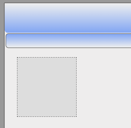
Obviously, I only included part of the page in the screen capture above. The resulting code (which I can export) is shown below. Yes, I realize the code is hidden on the right by that sidebar. I simply wanted to show you the code which was rapidly created. I do want to encourage you to try out this tool (as opposed to just copying the code I generated). If you really want the code, I provide it in a zip file for you to download.
.navigation {
  box-sizing: border-box;
  -moz-box-sizing: border-box;
  background-image: -moz-linear-gradient(top,  rgba(22, 94, 248, 1) 0%, rgba(239, 240, 240, 1) 100%);
  background-image: -webkit-gradient(linear, left top, left bottom, color-stop(0%,rgba(22, 94, 248, 1)), color-stop(100%,rgba(239, 240, 240, 1)));
  background-image: -webkit-linear-gradient(top,  rgba(22, 94, 248, 1) 0%,rgba(239, 240, 240, 1) 100%);
  background-image: -o-linear-gradient(top,  rgba(22, 94, 248, 1) 0%,rgba(239, 240, 240, 1) 100%);
  background-image: -ms-linear-gradient(top,  rgba(22, 94, 248, 1) 0%,rgba(239, 240, 240, 1) 100%);
  background-image: linear-gradient(to bottom,  rgba(22, 94, 248, 1) 0%,rgba(239, 240, 240, 1) 100%);
  filter: progid:DXImageTransform.Microsoft.gradient( startColorstr='#165EF8', endColorstr='#EFF0F0',GradientType=0 );
  width: 900px;
  height: 50px;
  opacity: 0.5;
  border: 2px solid #000000;
  border-radius: 10px;
  -webkit-border-radius: 10px;
  -moz-border-radius: 10px;
  -ms-border-radius: 10px;
  -o-border-radius: 10px;
}

.header {
  box-sizing: border-box;
  -moz-box-sizing: border-box;
  background-image: -moz-linear-gradient(top,  rgba(239, 240, 240, 1) 0%, rgba(22, 94, 248, 1) 100%);
  background-image: -webkit-gradient(linear, left top, left bottom, color-stop(0%,rgba(239, 240, 240, 1)), color-stop(100%,rgba(22, 94, 248, 1)));
  background-image: -webkit-linear-gradient(top,  rgba(239, 240, 240, 1) 0%,rgba(22, 94, 248, 1) 100%);
  background-image: -o-linear-gradient(top,  rgba(239, 240, 240, 1) 0%,rgba(22, 94, 248, 1) 100%);
  background-image: -ms-linear-gradient(top,  rgba(239, 240, 240, 1) 0%,rgba(22, 94, 248, 1) 100%);
  background-image: linear-gradient(to bottom,  rgba(239, 240, 240, 1) 0%,rgba(22, 94, 248, 1) 100%);
  filter: progid:DXImageTransform.Microsoft.gradient( startColorstr='#EFF0F0', endColorstr='#165EF8',GradientType=0 );
  width: 900px;
  height: 100px;
  opacity: 0.5;
  border-radius: 10px;
  -webkit-border-radius: 10px;
  -moz-border-radius: 10px;
  -ms-border-radius: 10px;
  -o-border-radius: 10px;
}

.hero-image {
  box-sizing: border-box;
  -moz-box-sizing: border-box;
  background-color: #DDDDDD;
  width: 200px;
  height: 200px;
  opacity: 1;
}
Does this CSS-3 code validate in the W3C CSS Validator? For the most part. The features for Internet Explorer cause validation problems (go figure). But, the majority of the code will validate. So you can rapidly create simple CSS-3 enhancements to your page in a more graphical manner.
Obviously, there are a number of additional features and capabilities. I just wanted to cover some of the basics. I encourage you to try out these sorts of tools for in browser design/ development. I am curious whether you have used this tool. I am also curious if you found this article useful. I look forward to your comments.
 Loading ...