I previously discussed the Illinois web design contest at a high level. I thought it would be important to also focus a bit on the code and related design aspects of the sites. Note that these comments are my own and do not represent the observations of any judges in this event).
In reviewing the code, I congratulate everyone in not having any “Untitled Document” pages. I also congratulate everyone on not trying to give the judges a virus. This is the second year in a row that we have not encountered any virus (yes, we did in almost every year in the 13 prior years). Now, let’s examine some of the more technical aspects of the entries submitted (as you may anticipate, I will not name specific teams nor will I share the content of any team submission as that would violate the rules of the competition).
From a design perspective, it is important to recall the main categories:
- proximity,
- alignment,
- repetition,
- contrast
This helps organize materials on a page and helps make each page consistent (and more usable for visitors).
Since it is 2015, it is important we all use HTML5 where possible. Actually, I prefer that is it is so much easier to write the DOCTYPE – <!DOCTYPE html >. Quick – tell me the full DOCTYPE for XHTML 1.1 strict. Yeah, I couldn’t do that either anymore. In addition to using HTML5, it is important to take full advantage of HTML5 features (including placeholder information and most importantly semantic markup). Permit me to demonstrate a simple example as to why semantic markup is so important.
Consider a simple form with a single field asking for an email address. If I use type=”text” attribute for my input element, I will often see the following on my smartphone. See – I used placeholder text so I “know” HTML5, don’t I?
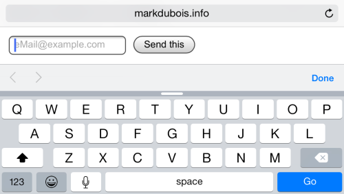
Sure, this is workable. To enter my email address, I have to type the first part of my email, then I have to type the @ symbol. Now, where is that? Oh, yeah, I need to tap the 123 key. After doing so, I return to the prior keyboard and continue with the address. Wait, where is the period? Oh yeah, I have to tap the 123 key and then enter the period, then return to this keyboard. From a user experience perspective, there must be a better way.
Yes, there is. If I use the attribute type=”email” on my input element, I will see the following keyboard on my smartphone. I see this because I am taking advantage of semantic markup and the phone realizes this is an email address.
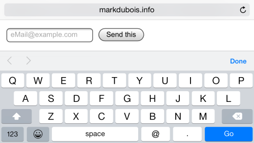
Now, I can type my entire email address without using an alternate keyboard. This saves me time as a visitor and I am much more likely to return to this site for more information as they “get it.” Total extra cost from a web designer/ developer perspective, 1 extra character (yes, 1 stinkin character – type=”text” [11 characters] vs type=”email” [12 characters]).
Although a number of entries used HTML5, most did not fully comprehend the semantic markup (and why it is important).
Use comments throughout your code (HTML, CSS, JavaScript). Not only who, what, why, when, but also explain what you are trying to accomplish. I was pleasantly surprised in a few cases when the participants did not know the exact code, but knew enough to include comments as to what they intended.
If one is presented with over 20 complete font sets, it is a safe bet that you should use at least one of them when formatting your HTML. Actually 2-3 fonts are generally accepted as best practice on web pages these days. Given that each set contained sample code one could copy and paste, all the more reason to use them. In many professional designs these days (with common flat designs), it is type (@font-face) that differentiates sites. Learn the fundamentals of typography and employ the concepts on sites you create.
Color theory is also something everyone should know a little about. Learn to employ appropriate colors in your design.
Along with color, images are important (placement and optimization). Resize images appropriately, do not rely on the browser using height or width attributes only. I mentioned mobile devices earlier (my smartphone and semantic markup). If you are viewing a web page on a slower mobile network, one may wonder why it takes forever for a small image to load. This might be because it has not been resized so it is really a very large image loading and being displayed in a miniscule spot.
Think also in terms of responsive design. Many have some understanding as demonstrated by using percentages in their CSS for width. However, don’t break this by then forcing height as a hard coded pixel value. Also, em’s can be used for more than just font-size.
Think also in terms of accessible pages (and SEO – they are tightly coupled. After all, the majority of visitors to your pages are blind (search engine bots). The majority of pages used alternate text for images, but pages should also linearize if viewed without CSS. Since CSS-3 works in most browsers these days, it is rare that one should even consider including text directly in an image (using tools like Photoshop). If the text is meaningful, make it text. If the text is not meaningful, why include it?
Yes, I could go on and on about potential improvements. For example, pages should be tested in multiple browsers (including mobile devices). I realize everyone was under time constraints and this helps explain why not all of these items were included on many pages. However, I could direct my above comments to many pages I find at random on the Internet these days. Those developers don’t have that excuse.
As always, I look forward to your comments.
 Loading ...